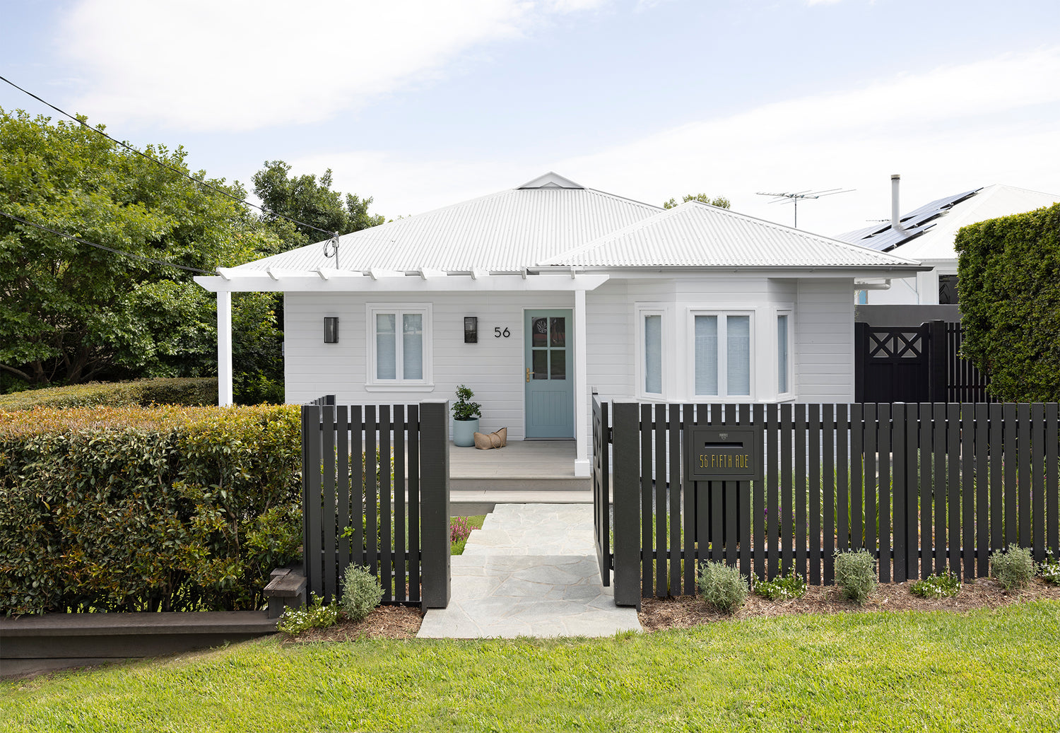
Location: Tarragindi, Brisbane
Who lives here: A busy professional couple & their 2 boys
Brief: Our client’s powder room was feeling a bit tired and in need of a refresh with some signature FPP style. This space needed to feel like a natural extension of the Coastal Luxe ensuite we recently completed, while also tying in some of the Hamptons-inspired elements from the stunning kitchen makeover we created for these wonderful clients a few years back. The goal was to strike the perfect balance between both designs for a cohesive, refreshed look.
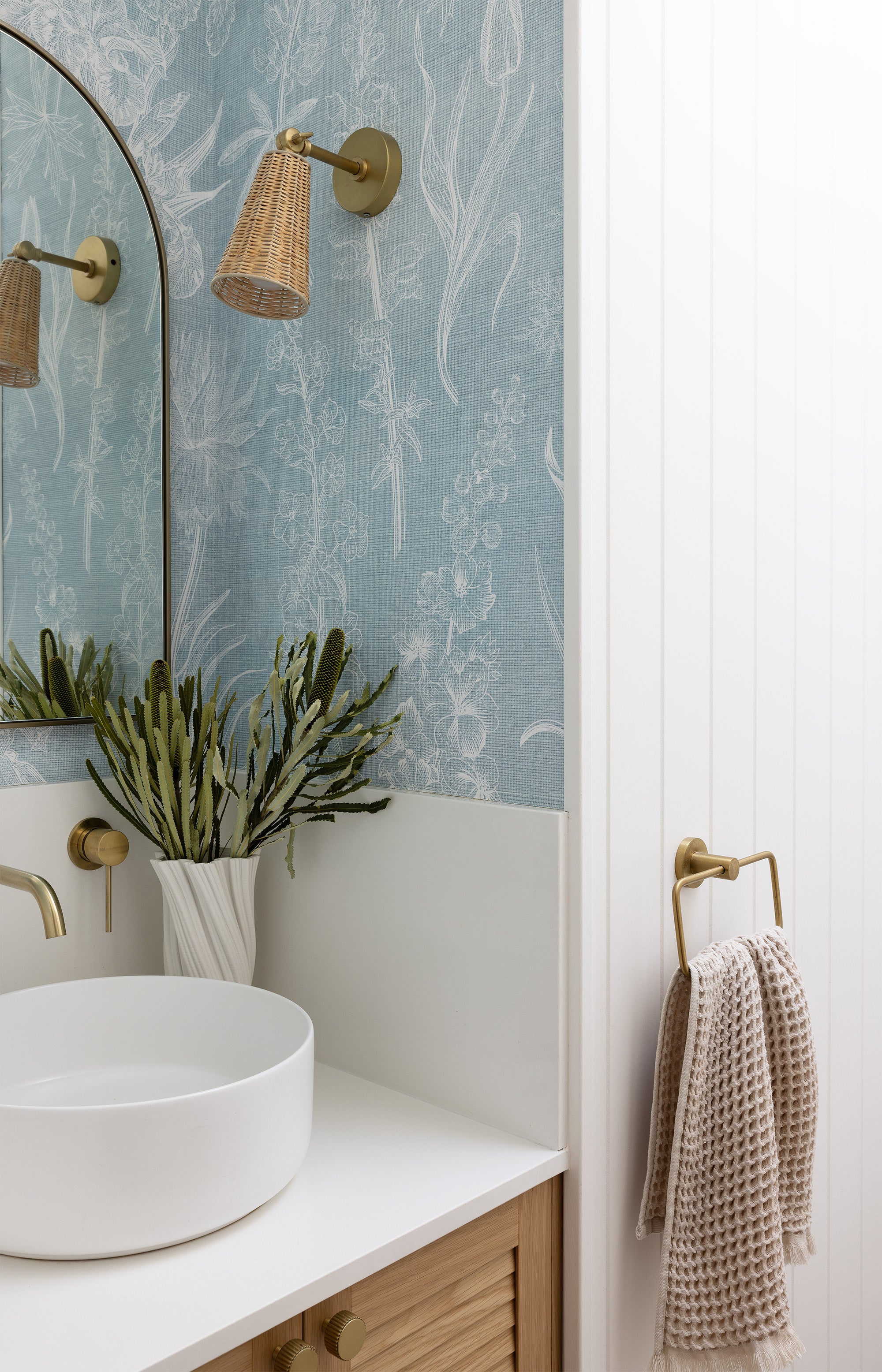
Scope of Works: To breathe new life into the powder room, we introduced elements that bring warmth, texture, and light to the space. Key features include VJ wall panelling, water-resistant textured wallpaper, warm wood accents, and brushed brass tones, all complemented by beautiful louvered door fronts. We kept the existing vanity structure and replaced only the doors, preserving the original ceiling cornice and neutral floor tiles, and adding updated skirting boards for a fresh finish. A coastal rattan light fixture lends a touch of charm, while the true showstopper is the skylight, transforming the space with an abundance of natural light.
Featuring custom oak louvred vanity doors (we retained the vanity carcass as it was still in great condition and simply upgraded the door fronts), stunning wallpaper, crisp white VJ wall panelling, brushed brass fittings, and a cute rattan and brass wall sconce, every element in this charming powder room makeover exudes luxury and style.
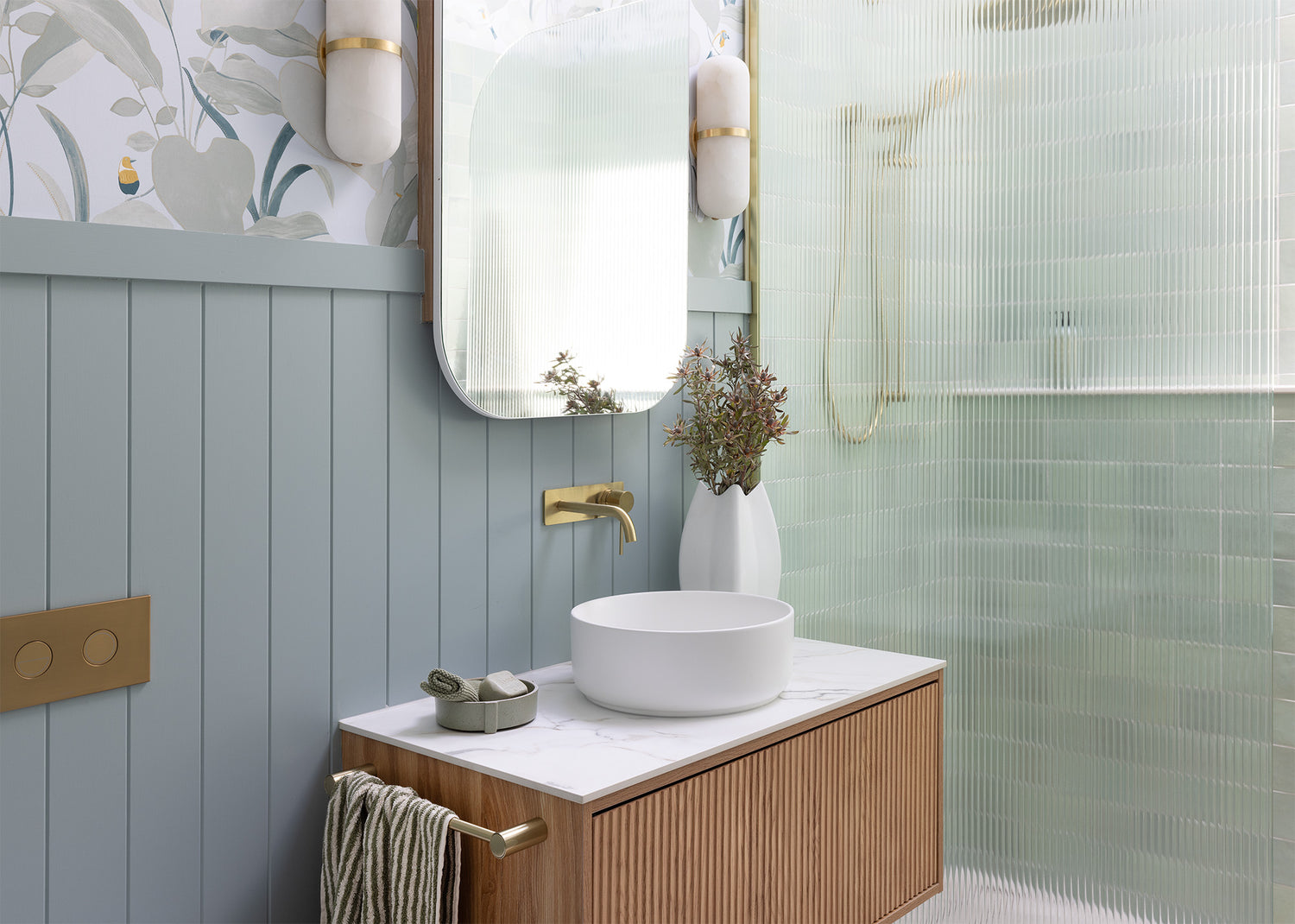
Tapware plays a crucial role in any bathroom project we undertake. For the powder room, it was essential to carry the style of the tapware from the ensuite to ensure a cohesive design. This time we chose the Phoenix Vivid Slimline Range from The Blue Space, in brushed gold. You can check them out here: Wall Basin Outlet and Wall Mixer.
Enjoy the before and after photos, a beautiful transformation. It's incredible how a fresh style breathes new life into the tiniest of spaces.
To meet the client's wish for a lighter, warmer powder room, a beautifully designed skylight was added. See the details of the skylight position in one of our inhouse working drawings below.
The natural light it brings has really brought out the best in the other finishes, making the entire space feel more vibrant and inviting.
Step inside the renovation process with these construction progress photos.
From the careful mitring of VJ wall panels to the exact placement of a skylight, every detail in this small powder room is executed with precision. It's in these compact spaces that we truly focus on the finer points - where perfection takes precedence.
Our client wanted a wallpaper that was both beautiful and practical. With two young boys known for their splashing, we knew we needed something that could withstand a bit of water. Soft blues were the perfect choice, creating a fresh and playful vibe while remaining sophisticated enough to match their mum’s refined sense of style. The result is a space that’s both durable and stylish—perfect for a busy family!
It’s hard to capture in the photos, but the wallpaper has a subtle, refined texture that adds an extra layer of sophistication to the space. We love incorporating delicate details like this as they help elevate the overall design, seamlessly blending with the other elements to create a fresh yet beautiful aesthetic.
How charming is the rattan and brass wall sconce? We always love incorporating a feature wall sconce into our bathroom renovations, as it truly enhances the space and provides an opportunity for added ambiance beyond standard downlights. In this instance, it introduces an extra layer of texture that beautifully complements the subtle weave of the wallpaper.
The brushed brass arched mirror was the perfect finishing touch, adding a modern element to the space. It tied in beautifully with the tapware and wall sconce.
Reno Tips:
VJ sheeting is an easy and effective way to give any space a fresh look. Here, we simply applied the sheeting over the existing walls, instantly adding depth and character.
To save on costs, we worked with the existing floor tiles, which had a natural finish we could easily incorporate into the new design. We replaced the dated tiled skirting with crisp white timber skirting boards for a clean, updated look—simple yet impactful. A bullnose style board was selected to match the skirting used throughout the home. On the ceiling we also retained the existing cornice, a further cost saving tip.
The toilet was still in great condition, so instead of replacing it, we used the savings to invest in a transformational skylight, bringing natural light into the room and completely elevating the space.
The vanity framework was in great condition, so we opted to upgrade just the door fronts with these beautiful oak louvred panels and added fresh stone tops. We also raised the splashback surrounds to accommodate the boys' splash factor. The Matte White Counter Basin from our friends at The Blue Space was the perfect choice, as it didn’t take up too much space on the vanity. Check it out here: ADP Margot Above Counter Basin.
Whoever said a toilet space need only be practical? Certainly not us girls at FPP! We believe even the smallest spaces deserve style and attention to detail.

