Location: Tarragindi, Brisbane
Who lives here: A busy professional couple & their 2 boys
Brief: Our client was desperate to change the look and feel of her ensuite which was a little tired, dark and dated. The brief was to create a luxurious coastal vibe with a soft blue palette while incorporating extra storage wherever possible.
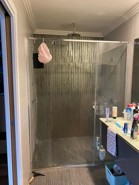
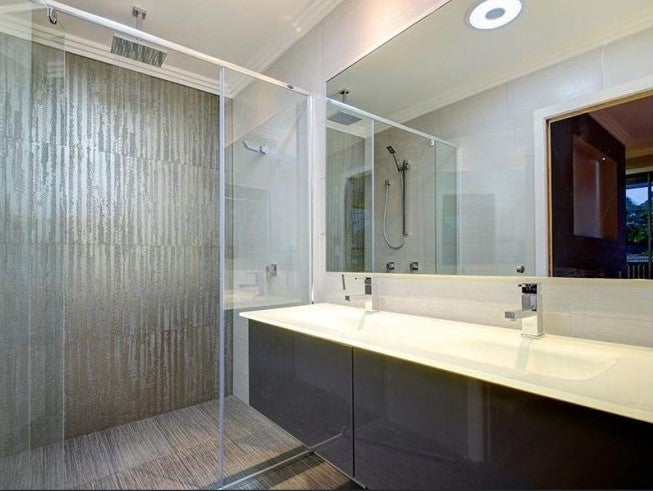
Scope of Works: The existing ensuite lacked windows and featured dark tiles and cabinetry, making the space feel closed off and in need of a major update. It was truly ready for an extensive refresh.
Our Coastal Luxe Bathroom was a wonderful transformation for one of our long-standing clients. A few years ago, we had the pleasure of creating a stunning kitchen makeover for them, which featured a touch of Hamptons charm. Following both these successes, we have since been invited back to continue refreshing their home, completing a gorgeous renovation of their powder room on the lower level of their home.
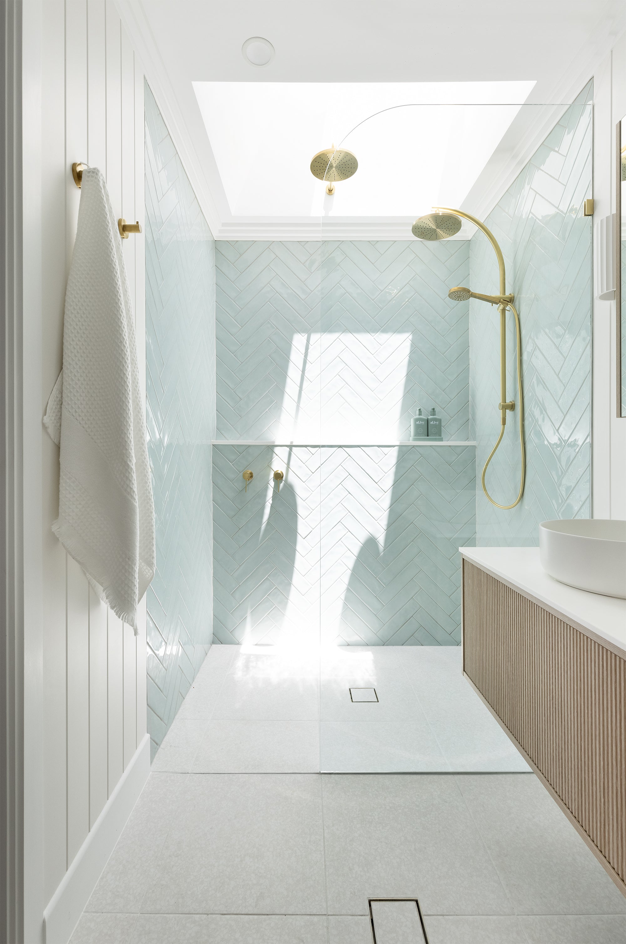
This serene ensuite transformation took a once dark and dated space and completely rejuvenated it with luminous day-spa vibes. The addition of a spacious skylight positioned directly above the walk-in shower enhances the sense of openness while flooding the room with natural light.
To enhance the spa-like vibes, our homeowner was really hoping to incorporate a double shower. Although we were tight on space to have showers at either end, we found a perfect solution that also created a stunning focal point: adding an extra rain shower off the side of the skylight shaft. It offers a truly serene experience—showering while gazing up at the natural sky above.
We also paid special attention to design details such as ensuring the radius of the shower screen perfectly matched the arch radius of the twin shower rail set. It's these small, considered touches that, while they may seem time-consuming during the process, truly elevate the overall look and feel of the space in the end.
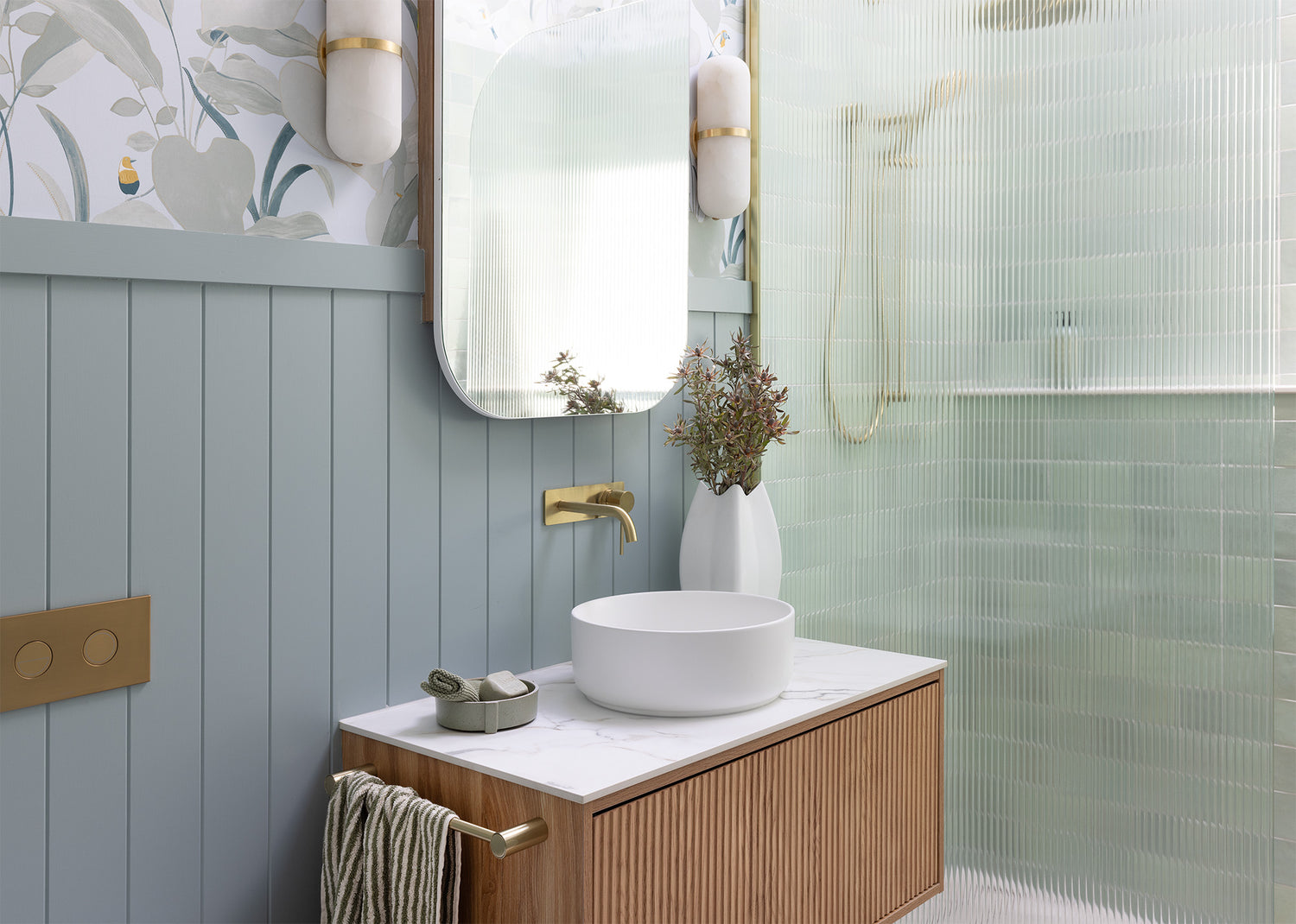
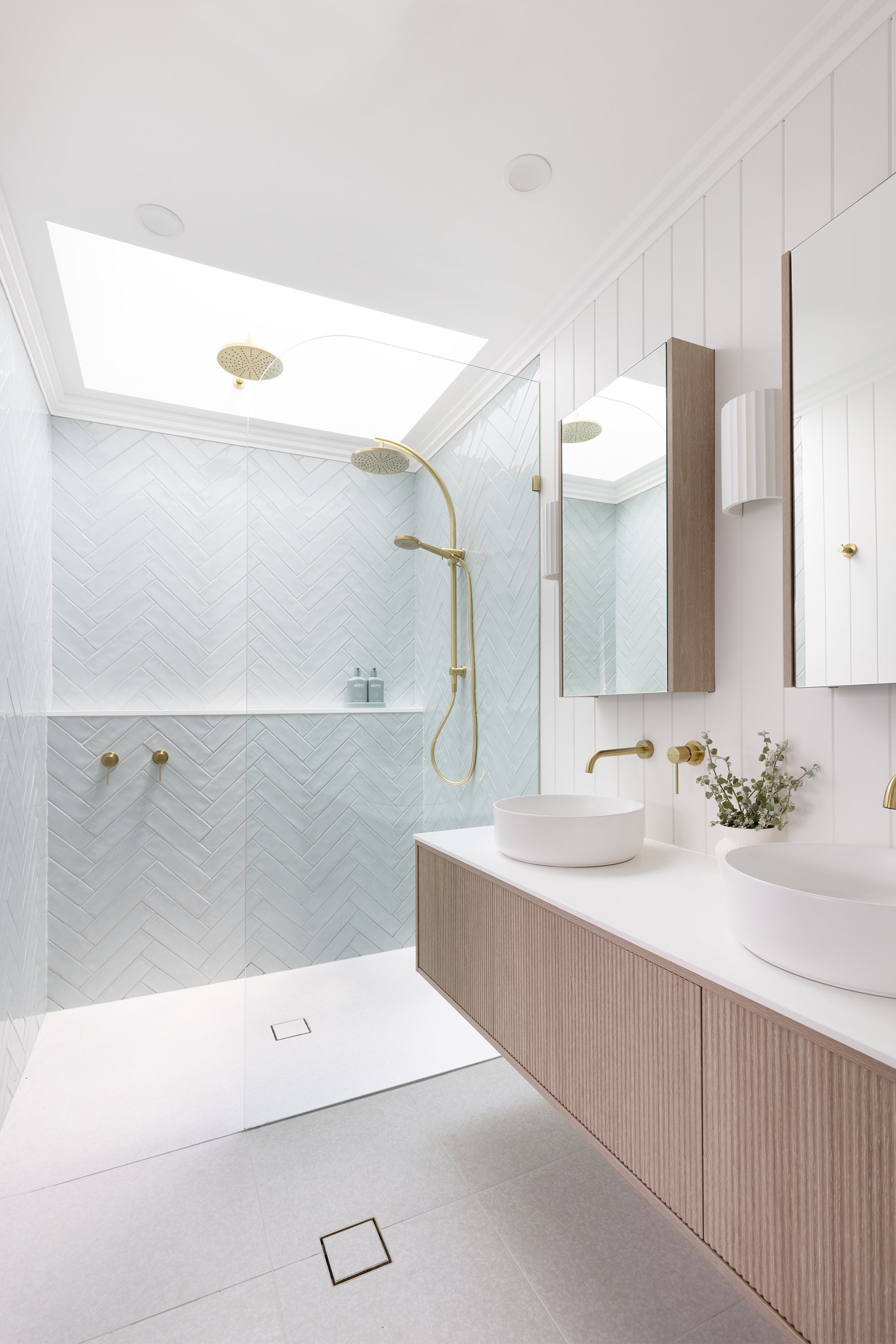
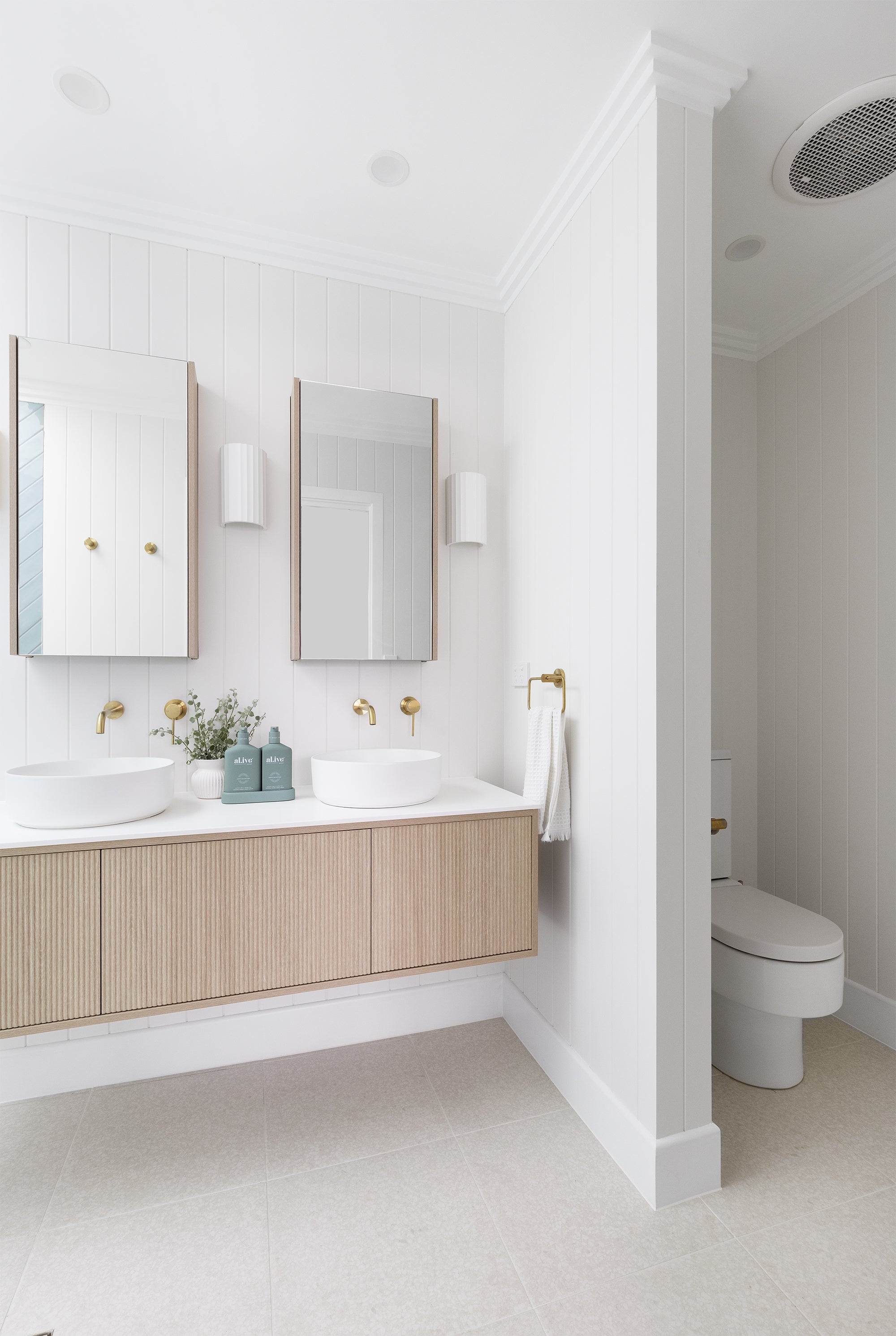
A key highlight of this bathroom is the relaxed coastal vibe created by the VJ panelled walls, which add texture and depth to the space. The subtlety of the VJ panels beautifully complements other design elements, such as the herringbone tiles and ribbed-front vanity, bringing a real sense of warmth to the space. And of course, what’s a shower without a full-length storage/display ledge? We maximised the shower space by extending the ledge the full length of the main shower wall. This not only makes the area feel larger but also elevates it to have a spa-like experience.
The brushed gold tapware adds the perfect finishing touch, offering a blend of contemporary style with timeless elegance. Here we chose the Phoenix Vivid Slimline Range from The Blue Space, in brushed gold. You can check out our selections here: Wall Basin Outlet | Shower Wall Mixer | Slimline Twin Shower | Shower Rose
The before-and-after photo sliders below showcase the incredible impact this beautiful transformation had on the space. Seeing the dramatic difference in the space leaves us feeling just a tad proud of the results!
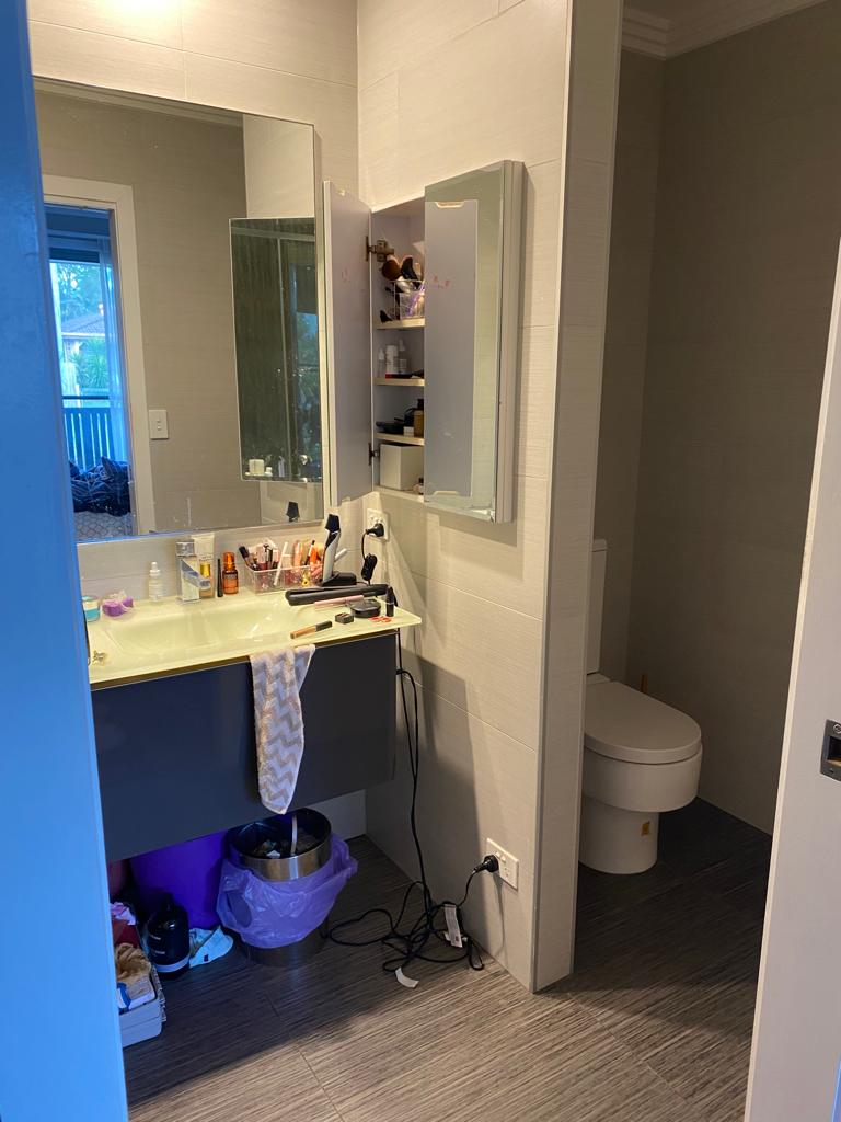
For this particular bathroom, we were a little savvy to save on some costs for our client. Where possible (outside of the shower space of course), we tiled or VJ sheeted over the top of existing wall tiles, this cost saving allowed us to be able to incorporate the skylight that you see, bringing in amazing light to the whole bathroom. We also utilised the existing cornicing and toilet to save some bucks, but we made sure that we updated the space with all new, freshly painted white skirtings, this simple detail really finishes the floor edging beautifully.
For this bathroom renovation, we were fortunate to work with an already great layout. We consider this similar to striking gold, in terms of construction budget. Making it a nice middle-ground project, somewhere between a full gut and a cosmetic refresh. As builders, we often find that in very old homes, the layouts are usually so poor that keeping the existing plumbing just to save money isn’t worth it. A bad design can greatly compromise the space, so it’s often better to invest in fixing the layout. However, in homes built from the 90s onwards, the floor plans are generally more functional, so renovations can focus more on aesthetic improvements.
Step inside the renovation process with these construction progress photos.
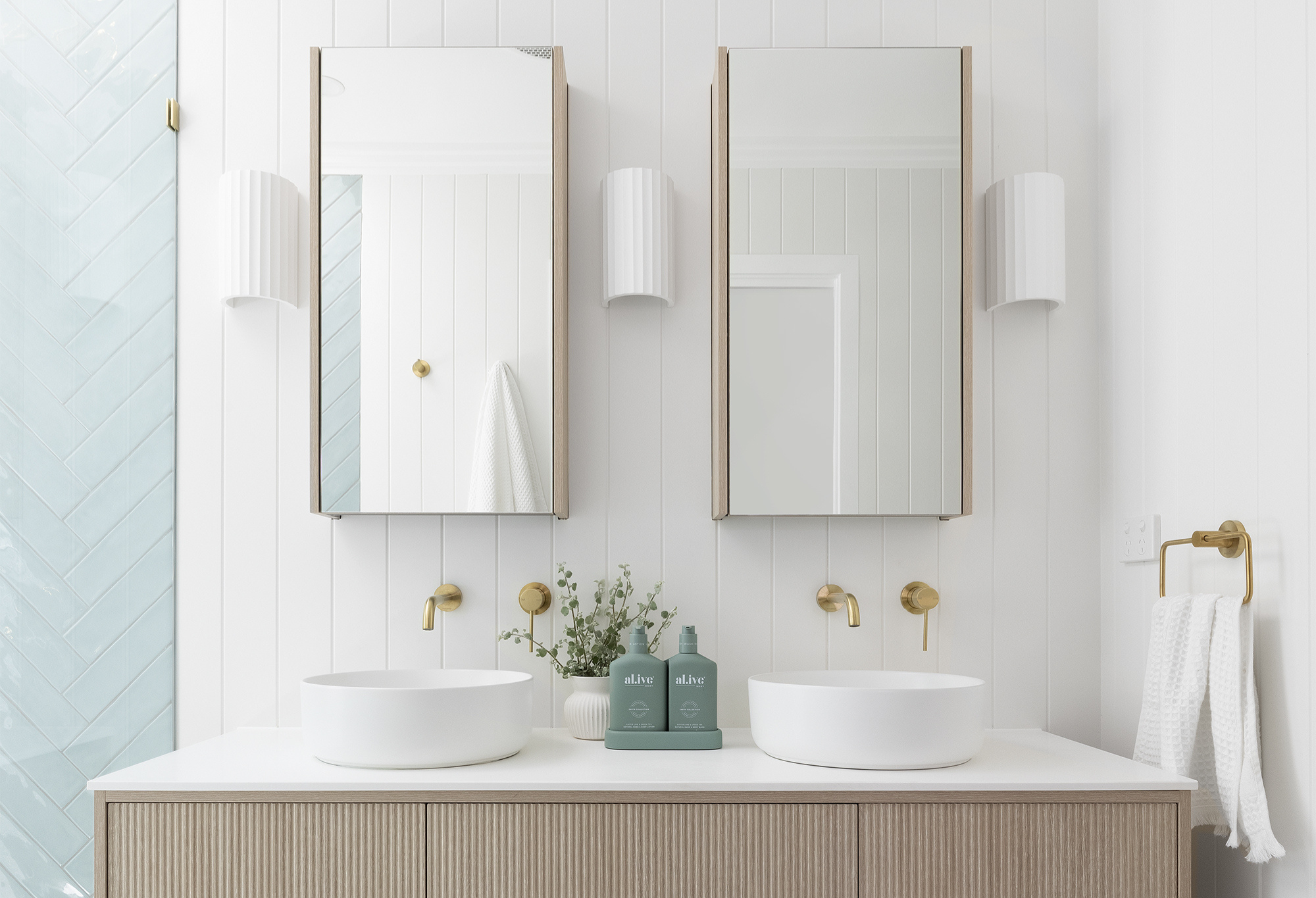
We love incorporating texture into any bathroom space, and for this project, we introduced this stunning ADP Clifton Off-the-shelf ribbed front vanity in soft wood tones. Extra wall storage was essential, and we love maximising additional bathroom storage whenever possible. These semi-recessed ADP Muse Mirror Cabinets from The Blue Space were just the right fit. All this paired beautifully with the herringbone tile pattern and semi-exterior VJ panelling on the main wall behind the vanity. To further elevate the design, we added subtle pops of texture with some gorgeous ribbed wall sconces.
The soft blue hue of the tile used on the shower walls sets the tone for all the other finishes in the bathroom. Crisp white paint on the existing ceilings further lightens and brightens the entire space. Finally, the soft golds of the tapware perfectly complement the subtle blues and whites, creating the coastal luxe atmosphere our client desired.
Reno Tips:
VJ sheeting is an easy and effective way to give any space a fresh look. Here, we simply applied the sheeting over the existing wall tiles, instantly adding depth and character. Always make sure to use semi-exterior grade VJ for behind your vanity.
To stay within budget, we opted for a cost-effective floor tile, which allowed us to allocate a little extra for the soft blue, organic-feel herringbone wall tile as a standout feature.
Since the toilet was still in great condition, we decided to keep it and allocate that budget towards crisp white skirting boards, giving the space an updated and classic appeal.
Using an off-the-shelf vanity is a great way to keep your bathroom renovation budget in check. Custom vanities can be quite expensive, so if you're looking to cut costs, this is one of the first areas we’d recommend exploring. The Matte White Counter Basin from our friends at The Blue Space was the ideal choice, as it didn’t take up too much counter space. Check it out here: ADP Margot Above Counter Basin.
We absolutely love how this bathroom makeover turned out, it really is like watching night and day!


